Color plays a critical role in creating a space’s mood and atmosphere. Colors we select for our homes and workplaces can have a significant impact on our emotions, productivity and overall wellbeing. This is where the concept of color psychology comes in.
WHAT IS COLOR PSYCHOLOGY?
Color psychology is the study of how colors influence human behavior and emotions. It is based on the idea that different colors make people feel and act in different ways. Blue, for instance, is commonly connected with calmness and relaxation, whereas red is associated with passion and energy.
Understanding the psychology behind colors is essential when designing a space. Here’s the psychology of each color and how it can be used in interior design.
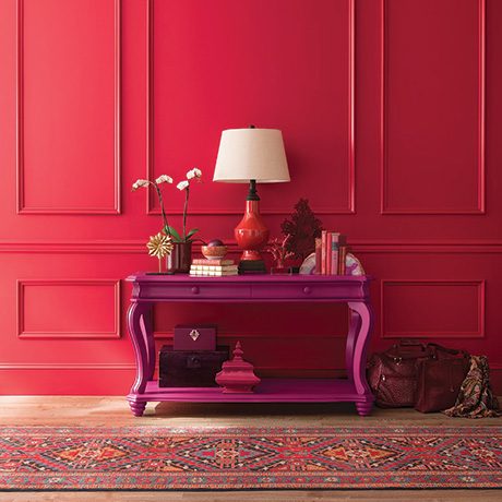
RED
Red is a fiery, intense color that often is linked to excitement and passion. It is known to increase blood pressure and heart rate and stimulate the appetite. Red can be used as an accent color in interior design to create a focal point or add energy. On the other hand, too much red can be overwhelming and cause anxiety.
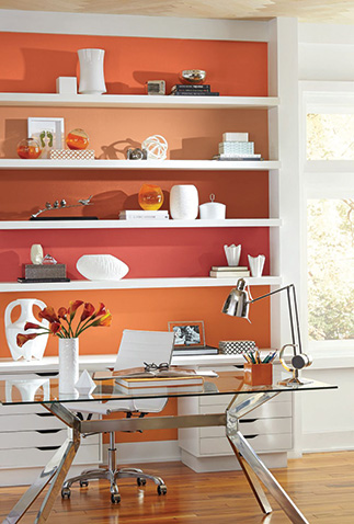
ORANGE
Orange is a welcoming and warm color that is often associated with enthusiasm, creativity and warmth. It has been shown to increase appetite and promote social interaction. Orange can be used as an accent color; try a muted tone to create a cozy, welcoming atmosphere.
YELLOW
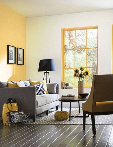
Yellow is a happy, optimistic and creative color. It is known to increase mental activity and improve memory and concentration. Yellow is a great accent color for bringing sunshine, a sense of warmth and positivity to a room. However, too much yellow can be overpowering.
GREEN
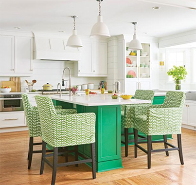
When we think of green, we often think of nature, growth and harmony; it’s
both calming and refreshing. It is known to reduce stress and promote relaxation. Green can be used to create a sense of balance and harmony. It’s also a great color for bedrooms and other spaces where you want to unwind.
BLUE
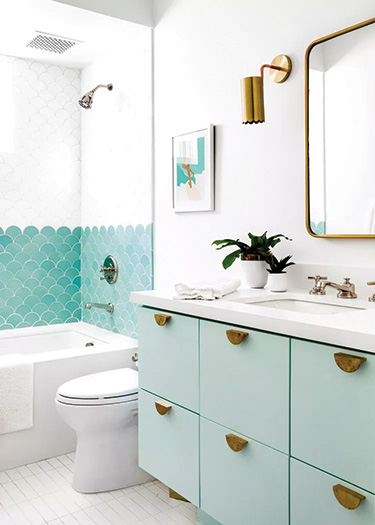
People often feel calm, peaceful and trusting when they see blue. Using
blue as an accent color in interior design is thought to promote feelings of tranquility. It is another excellent choice for bedrooms, bathrooms and other places where relaxation is a priority.
PURPLE
Purple often is associated with creativity, spirituality and royalty because of its luxurious, rich quality.
It is also known to stimulate creativity and imagination. When used as an accent color, purple can create a sense of opulence and sophistication. This hue is a great choice for places where you want to inspire creativity.
PINK
Pink is scientifically proven to reduce stress. It is a soothing, nurturing color that is related to love, compassion and femininity. It’s perfect for rooms where calm and comfort are most important, such as bedrooms, nurseries and living rooms.
BLACK
Black is known for instilling a sense of drama and sophistication. It is a color that is correlated with power, authority and elegance, and in interior design, it also can create contrast. It’s a great shade for rooms with a contemporary or minimalist style.
WHITE
White is a timeless color that inspires a sense of calm and cleanliness. To make a room feel brighter and lighter, white often is used as the primary color. It is a great option for small spaces or rooms with low light.
By understanding the emotional impact of different colors and how to apply them, you can create a space that not only looks great but also has a positive impact on the people who inhabit it. Whether designing a bedroom, office or any other type of space, the right colors can help create the perfect atmosphere.