When it comes to design, color is much more than an aesthetic choice. It makes a statement, sets the mood and transforms a space. It packs an emotional punch, too, influencing feelings and behaviors and creating a lasting impression.
In choosing their 2026 colors of the year, brands have leaned into warm neutrals, earthy greens and calming tones. Their choices reflect a shift away from the bright, energetic colors of previous years to emphasize comfort, calm, and, in some cases, dramatic sophistication.
If you need inspiration for your next painting project, look no further than these of-the-moment shades:
Pantone: Cloud Dancer
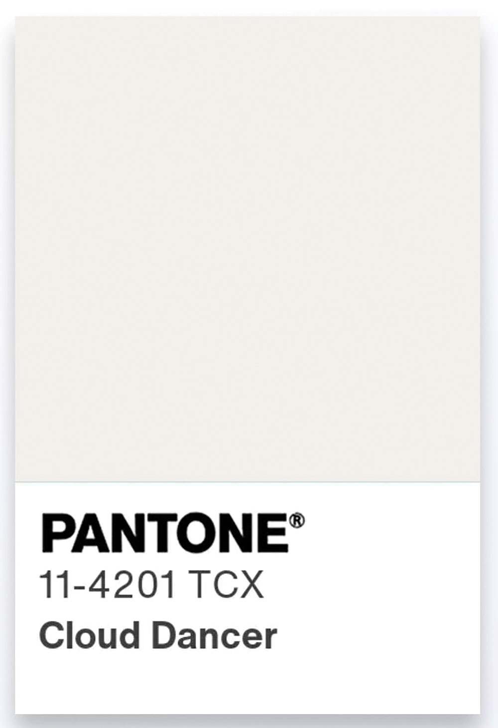
The global color authority Pantone chose this soft, airy hue, describing it as a “billowy white imbued with serenity.”
Benjamin Moore: Silhouette AF-655
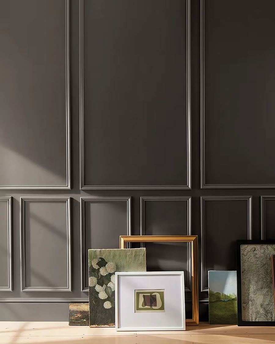
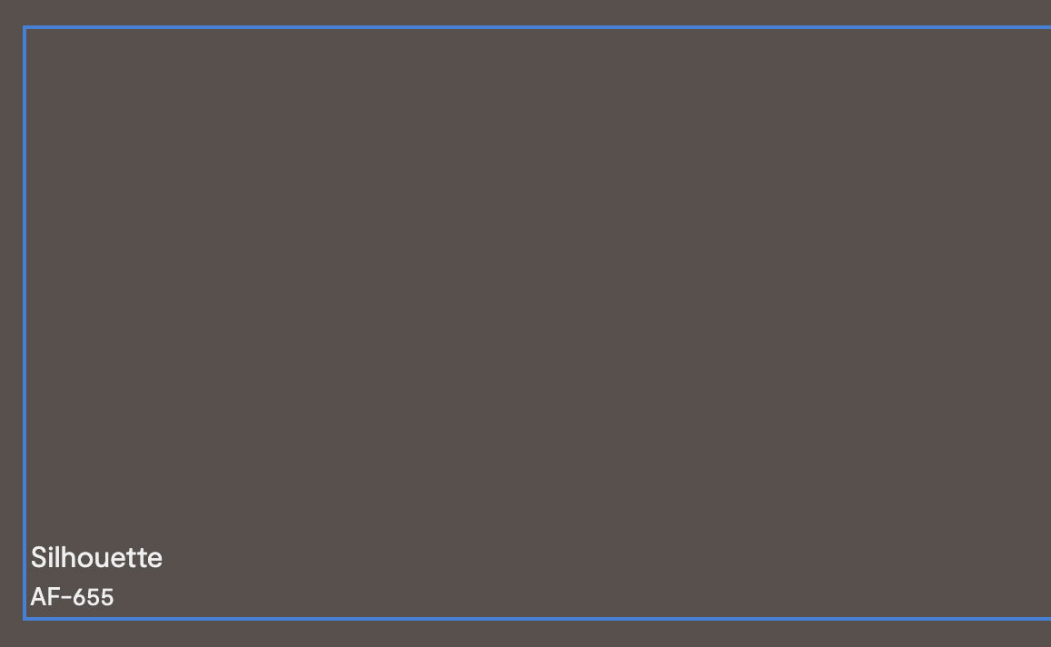
This rich brown shade, Benjamin Moore’s color of the year, “weaves luxurious burnt umber with delicate notes of charcoal,” according to the brand.
Sherwin-Williams: Universal Khaki
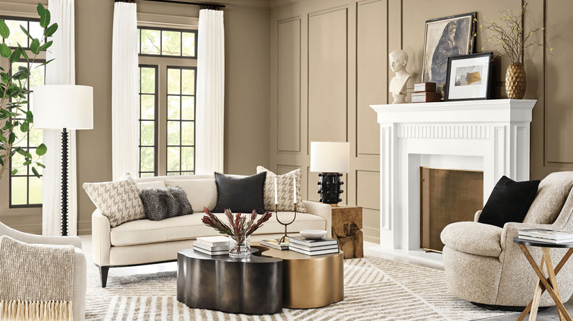
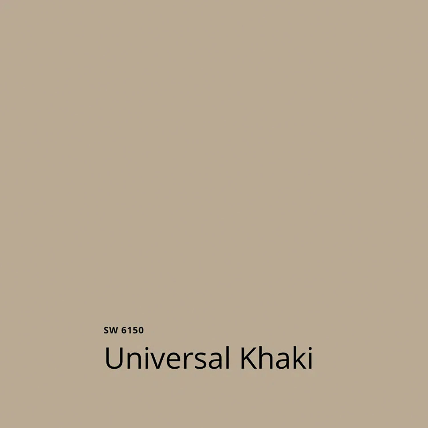
In announcing its color-of-the-year pick for 2026, Sherwin Williams said its experts chose this easygoing neutral with a slight yellow undertone for its “beautiful balance of livability and longevity.”
Behr: Hidden Gem
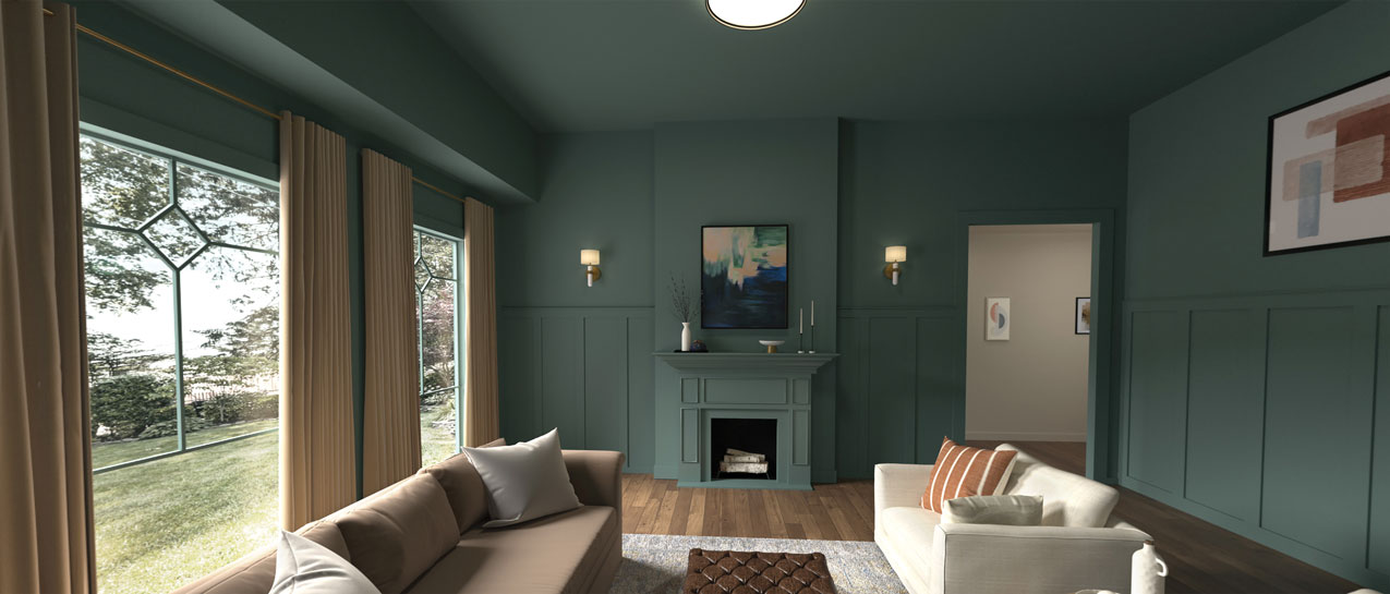
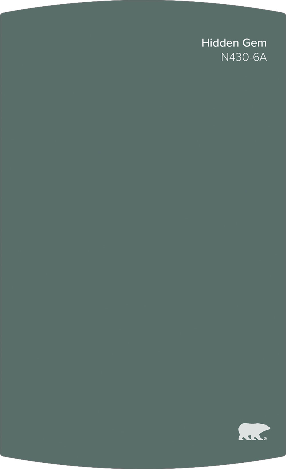
A smoky jade that’s both gentle and captivating, Behr says this dynamic color has “an air of mystery” and creates spaces “that feel both grounded and alive.”
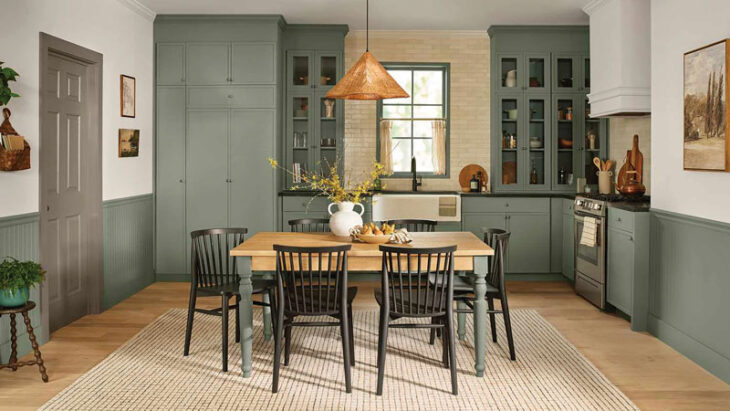
Valspar: Warm Eucalyptus
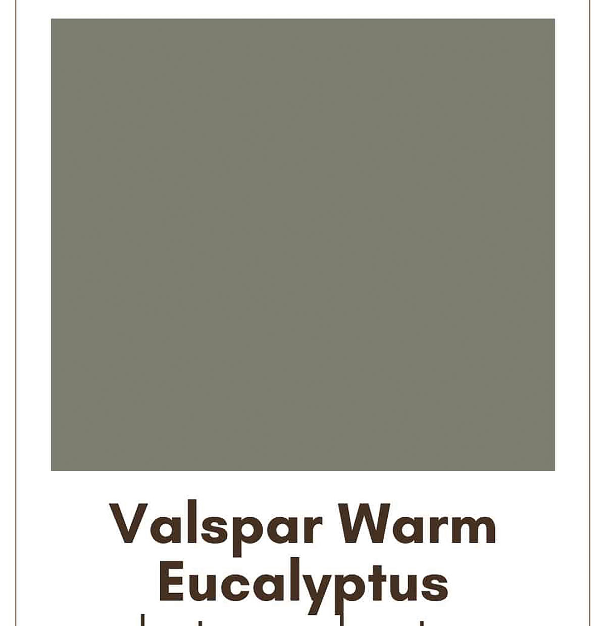
Valspar’s choice, a muted, nature-inspired green, was inspired by “mindful living — slowing down time and injecting restorative design to appreciate small moments,” according to the brand.
Glidden: Warm mahogany
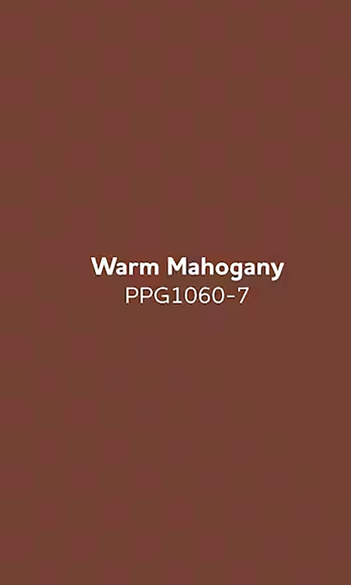
Glidden says this deep, earthy red-brown shade is “bold enough to draw immediate attention and reserved enough to make a timeless statement.”